Understanding CCDF Curves
To better understand CCDF curves, this discussion uses a cdmaOne signal as an example. Figure A shows the power versus time plot of a 9-channel cdmaOne signal. This plot represents the instantaneous envelope power defined by the equation: Power = I2 + Q2 where I and Q are the in-phase and quadrature components of the waveform.
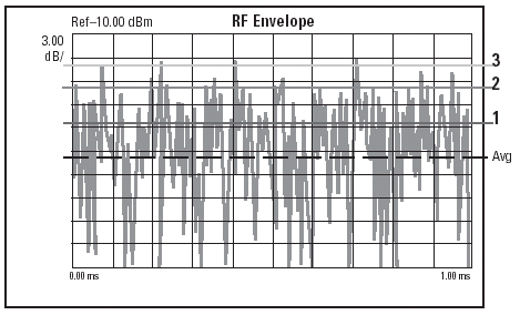
Figure A
Unfortunately, the signal in the form shown in Figure A is difficult to quantify because of its inherent randomness and inconsistencies. In order to extract useful information from this noise-like signal, we need a statistical description of the power levels in this signal, and a complementary cumulative distribution function (CCDF) curve provides just that.
A CCDF curve shows how much time the signal spends at or above a given power level. The power level is expressed in dB relative to the average power. For example, each of the lines across the waveform shown in Figure A represents a specific power level above the average. The percentage of time the signal spends at or above each line defines the probability for that particular power level. A CCDF curve is a plot of relative power levels versus probability.
Figure B displays the CCDF curve of the same 9-channel cdmaOne signal captured on the E4406A VSA. Here, the x-axis is scaled to dB above the average signal power, which means we are actually measuring the peak-to-average ratios as opposed to absolute power levels. The y-axis is the percent of time the signal spends at or above the power level specified by the x-axis. For example, at t = 1% on the y-axis, the corresponding peak-to-average ratio is 7.5 dB on the x-axis. This means the signal power exceeds the average by at least 7.5 dB for 1 percent of the time. The position of the CCDF curve indicates the degree of peak-to-average deviation, with more stressful signals further to the right.
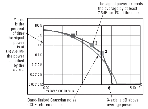
Figure B