Job Timing Diagram
The Job Timing Diagram displays a bar chart that lets you investigate the time consumed for the various acquisition and analysis tasks in running your Test Program. In the dialog's Display field, use the drop down to select a chart based on Fixtures or Engines (Acquisition Engines, Analysis Engines, and devices such as impairments). Using these charts, you can compare the times of different Hardware Diagram configurations.
|
|

|
Click left mouse button on chart grid (not a task bar) to stop the expansion of the chart's x axes.
 |
|
|
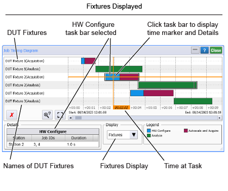
Click left mouse button on a task bar to set a time marker.
 |

|
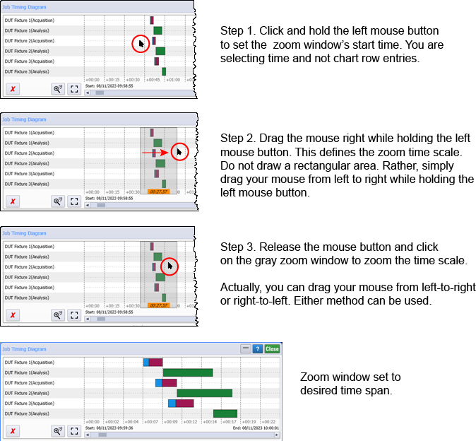
Click and drag left mouse button on chart to draw a gray zoom window. Release mouse button and click on zoom window to zoom the time scale. For more information, refer to How do I zoom the diagram's time scale? later in this topic.
 |

|
Click and drag right mouse button on chart grid (not a task bar) to pan left and right the chart's x axes.
|

|
Click to undo the last time-span zoom. |

|
Click to set the time scale to full span. |
|
|
Click to erase the chart's data. |
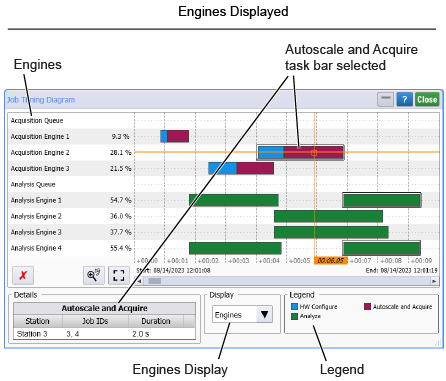
When viewing the Engine chart:
- Acqusition Queue bars show the percentage of test time consumed by jobs waiting to be processes. If acqusition queues consumes a large percentage of test time your PC my be overburdened.
- Acquisition Engine bars show the percentage of test time consumed by DCA-Ms (scope/clock recovery). If acquisition engines consume more than 90% of the time, your setup is very efficient. If acquisition engines consume less than 90% of the time, you might benefit by using more DCA-Ms in the test setup.
- Analysis Engine bars show the number of engines FlexOTO is using and the percentage of test time that they are consuming. If they indicate an overburdened PC, you may benefit by replacing the PC with a more powerful PC.
The Job Timing Diagram's Details field will be empty until you click on a task bar in the chart. The Details area of the dialog identifies the Station represented by the task bar, the Job IDs run, and the Duration of the selected task.
On the chart's Engines view, the percent values shown in the chart's first column, represent the time consumed by all of the tasks showed on the chart's row compared to the total displayed time span. The total displayed time span is the difference between the Start and Stop times listed at the bottom of the chart.
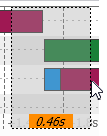
How do I zoom the diagram's time scale?
The ability to zoom the Job Timing Diagram's time scale is crucial to understanding the time constraints and efficiencies in you test setup. However, it is easy to zoom the chart's time scale. Simply drag your left mouse button horizontally across the chart, release the mouse button, and then click on the resulting gray zoom area. This is explained in more detail in the following picture.